
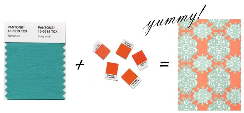
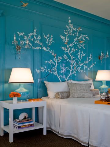
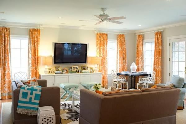
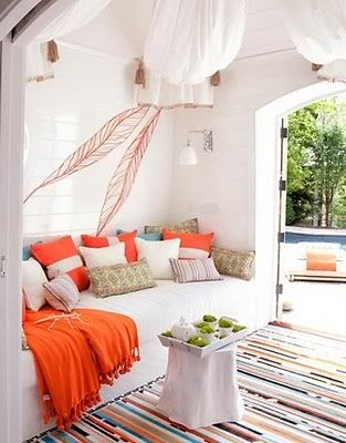
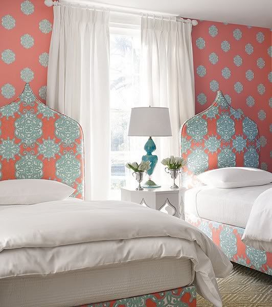
Ann Mack of the creative agency JWT predicted:"Saturated carnival colors - blues, oranges, greens and yellows - will replace 2009's paler palette; think Cirque du Soleil and Alice in Wonderland."
The turquoise and orange combo fits this description perfectly!
The turquoise and orange combo fits this description perfectly!
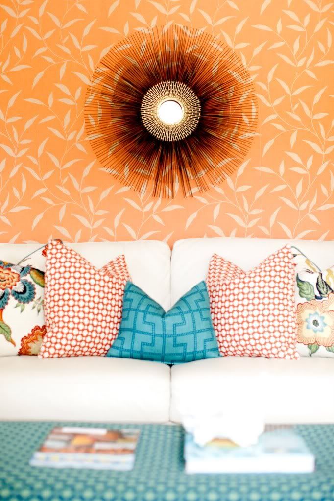


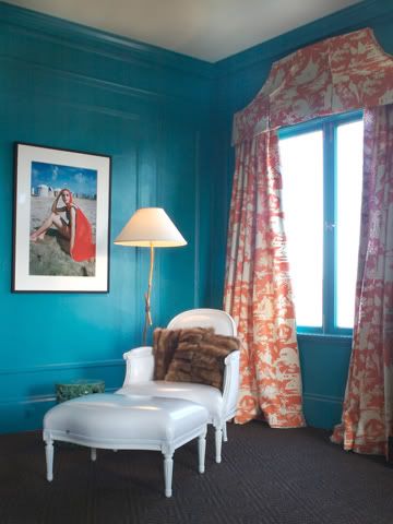
via Homes & Gardens
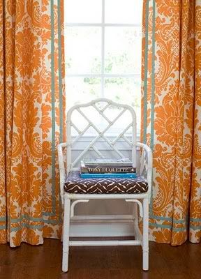
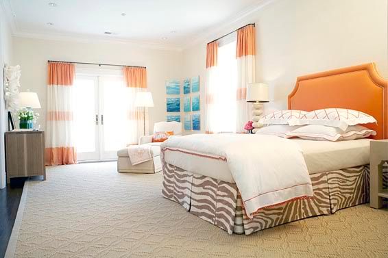
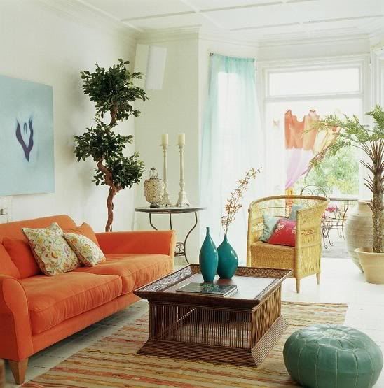
via Thibaut
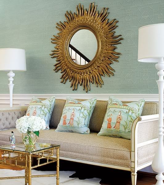
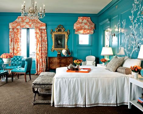
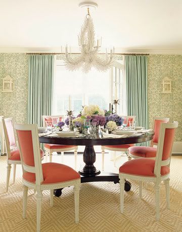
via Thibaut
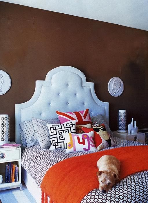
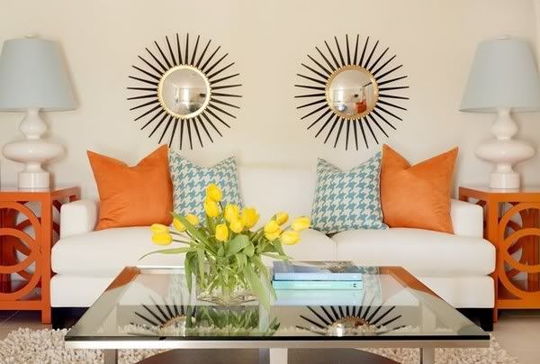
I love the variety of styles created with the same color palette: everything from the relaxed beach cottage feel to tufted tailored glamour! And one thing pops up consistently in each of these rooms; white! I think the touches of white {whether through accessories, furnishings, or on the walls} does so much to enhance the palette. One thing’s for sure…whether bold and punchy, or soft and subtle, I am loving this color combo!


0 comments:
Post a Comment