Awww, thanks Nancy!! And I’m honoured that you asked me to write a guest post for your lovely blog :-)
Our dining room, like most rooms, in our house, has been a work in progress for… well, for longer than I’d like to admit!! However, it IS close to being done now. The wainscoting is installed and painted, the ceiling and walls are painted, and the chandelier is installed…

The chairs are recovered in a funky lavender faux ostrich leather…

And the sexy new sideboard has arrived…

Really, all that’s left is to decide on a fabric for the curtains, hang some artwork, and accessorize. So what do I do?? I go and rethink the entire decorating scheme, of course!!
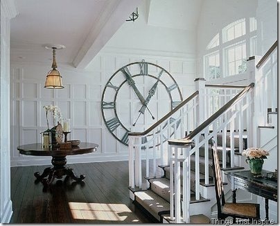
Although I love the wainscoting, I think I could love it more with one small (well, OK, BIG) change. Like most wainscoting, it goes about a third of the way up the wall. There was already a chair rail in the DR, so that dictated where the wainscoting stopped. But I want to bring it higher up the wall — and it’s all because of this picture:

First of all, I love the grid style of the wainscoting. Second, I love the big wall clock — and thanks to the CSN Stores gift certificates I recently won in Nancy’s giveaway and Lisa Goulet’s giveaway, I put them towards buying my very own big wall clock :-) Thanks ladies!!
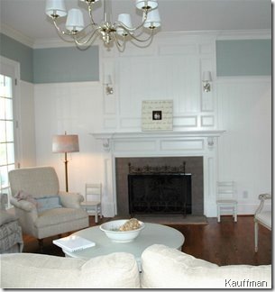
 And third, I love the look of the big wall clock on the wall with the grid panelling. So, now I want to take the wainscoting in our dining room higher up the wall. Here are some more examples of tall wainscoting.


What I love about this look is that the white wainscoting is the architectural detail it adds to the room. And painted white, it’s light and fresh. But there’s still some space between the wainscoting and the wall where you can use colour. Or, as Sarah did in the farmhouse she renovated on Sarah’s House 3, you can use a boldly patterned paper. Because there’s only a few feet of it, it doesn’t overwhelm the space. But it does make quite a statement, don’t you think??


So now is the hard part — convincing hubby to pull out his tools and math brain and add more wainscoting to the DR!! And if I can convince him to do that, I have some great ideas for decorating the rest of the room. You’ll have to head over to DesignTies and read Dining room decorating deliberations, Part 2 to see what else I have up my sleeve!!


0 comments:
Post a Comment